Welcome to the mobile app design World! Your app is a shining star in the store. It’s been downloaded by millions and is changing lives for the better.
People can’t get enough of its clever features. They love its intuitive navigation and stunning visuals.
That’s the power of a well-designed mobile app!
By 2026, the global market revenue of mobile apps will reach $614.40 billion.
Designing a great app is more about understanding your users. Create something that’s simply delightful to use. And trust me, that’s a skill anyone can master with a little guidance.
Ditch the intimidation and grab your imagination. We’re about to embark on a journey into the exciting world of design!
Why Good Design Matters
Think of your app as a conversation with your users. Good design is like speaking their language.
- It makes sure they understand your message loud and clear.
- Your app’s intuitive interface and clear information will keep users engaged.
- Its beautiful visual style will also help. They’ll come back for more and tell their friends about your amazing app!
No Coding Required
Hold on, before you start sweating about lines of code, let’s be clear. You don’t need to be a programmer to design a great app!
- Fantastic tools and techniques enable you to bring your vision to life. You don’t need to know how to code.
- Think of it like building a sandcastle. You can craft something truly impressive, even if you’re not an architect! With the right tools and a little creativity.
- So, are you ready to turn your mobile app design dream into reality? Grab your coffee, unleash your creative juices, and let’s design some apps that will rock the world!
- Remember, the only limit is your imagination. With this guide as your compass, you’ll be crafting masterpieces in no time. Happy designing!
Understanding Your Users
Remember, your app isn’t a solo act – it’s a two-way street with your users! Before you start building anything, put on your detective hat and gather intel.
User-centered design is all about crafting an app that solves their problems. It also delights their senses and makes their lives easier.
Think of it like this
- What superpowers does it have? What villains (frustrations) does it conquer?
- Your users are the fans: Who are they? What are their hopes, dreams, and Vulnerability?
Here’s your toolkit for user research:
- Quick and easy to gather general opinions and preferences.
- In-depth conversations to uncover deeper motivations and pain points.
- Watch real people interact with your app prototype and see what works (and what doesn’t!).
Remember, understanding your users well will help you create an app they’ll love.
Building Your App Foundation
Now, let’s lay the groundwork for your app’s success. Think of it like building a sturdy castle. You need a strong foundation first!
Define Your Purpose:
What’s your app’s mission? Is it to help people get fit, learn a new language, or connect with like-minded individuals? Having a clear purpose will guide your design decisions and keep you focused.
Know Your Audience:
Who are you building this app for? Are they tech-savvy millennials or grandparents with flip phones? Understanding your target audience is crucial. It helps you create an app they’ll use.
Decide the Core Features:
What are the must-have features that will make your app stand out? Think about the core functionalities that will solve your users’ problems. These functionalities should also make their lives easier.
Map the Journey:
Imagine your user navigating your app with great mobile app design services. What’s the logical flow from one screen to another? Creating user flows will help you design an intuitive and easy-to-use experience.
Prototype Like a Pro:
Before you dive into coding, test your ideas with simple prototypes! Paper sketches, wireframes, and low-fidelity mockups are your friends here.
They’ll help you visualize your app. They’ll help you identify potential issues. You can also get feedback from users early on.
Visual Style:
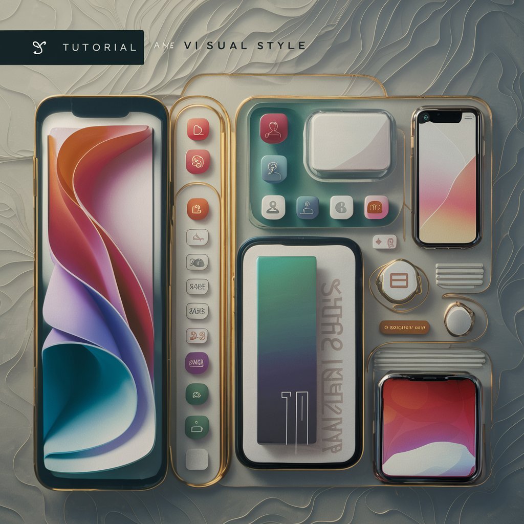
We’ve reached the fun part, let’s transform your app blueprint into a visual masterpiece.
Think of it like dressing your app for success. Instead of sequins and scarves, we’re using things like color, typography, and spacing.
Don’t worry, no fashion imitation passes here, just simple tips to make your app look like a million bucks (without actually spending one!).
Visual Hierarchy:
Imagine a stage with a dazzling performer, but then a spotlight also shines on the dusty curtain. Not so captivating, right? Visual hierarchy is like a spotlight. It guides users to the most important information first.
Think of headlines as bold singers that stand out. Think of secondary text as the supporting role. Think of clear buttons as eager stagehands.
Use size, color, and spacing strategically. Make sure users see what you want them to see. It will transform your mobile app development into a captivating performance.
Color Psychology:
Colors aren’t just pretty decorations – they’re powerful mood-setters! Red shouts “action!”, blue whispers “calm”, and green screams “freshness”.
So, choose your colors wisely! Think about your app’s purpose and target audience. Do you want to energize users with a vibrant palette or gently calm them with serene tones? Remember, color can evoke emotions and influence user behavior.
Choose wisely and watch your app come alive with personality.
Typographic Symphony:
Think of fonts as the voices in your app’s story. Do you want a playful, handwritten style for a kids’ game or a smooth and glossy, modern font for a business app? Choosing the right typeface is crucial for conveying your brand and setting the tone. Remember, readability is key.
Avoid overly decorative fonts that make users squint. Opt for clear, legible options that sing their message loud and proud.
Spacing:
Ever feel claustrophobic in a crowded room? Information overload can have the same effect on your app.
Spacing is like the air between words in a sentence, giving users room to breathe and focus on what matters. Use margins, padding, and whitespace strategically to create a visual hierarchy.
This helps prevent text from feeling cramped and makes your app feel airy and inviting.
Cohesive Style:
Imagine a rockstar outfit. The shirt clashes with the pants, and the shoes are from another planet. Not a good look, right? The same goes for your app’s visual style.
Choose a color palette that works together. Choose fonts that complement each other. Choose spacing that feels consistent.
Think of it like a well-curated outfit. Everything should work in harmony to create a unified and appealing visual experience.
Making it Easy & Fun and Accessible to Use:
Now, it’s time to make our apps the smoothest, most intuitive rides users have ever taken.
We’re talking tap-dancing fingers, intuitive navigation, and accessibility that makes everyone feel welcome.
Navigation Nirvana:
- Ever been lost in a maze of confusing menus and hidden buttons? Yeah, we’ve all been there.
- Think of familiar patterns. Tabs for quick access. Menus for deeper dives. And that trusty back button is like a comfy old sweater.
- Keep things predictable, logical, and within your thumb’s reach. Let’s face it: that’s where most app action happens.
Button Bonanza:
- Buttons are the superheroes of your app, guiding users through your digital wonderland. Make them clear, prominent, and oh-so-satisfying to tap.
- Think big, bold labels, generous spacing, and visual cues that scream “Click me!” Remember, buttons are a conversation, not a cryptic puzzle. Speak clearly, and users will follow with delight.
Accessibility Champions:
- Think of your app as a welcoming party, where everyone gets to have a blast.
- That means catering to diverse users. It includes features like larger fonts, clear contrast, and voice control options.
- Remember, accessibility isn’t just a nice-to-have. It’s a way to make your app truly inclusive and awesome for everyone.
Testing & Iterating:
- So, you’ve poured your heart and soul into crafting a stunning app, but is it truly a masterpiece? The answer, my friend, lies in the magic of testing and iterating.
- Think of it like polishing a diamond. Each round of feedback reveals another facet of brilliance. It makes your app shine brighter than ever.

Why Test? It’s All About the User:
Imagine launching your app with stunning features and by great mobile app design services. Users are tripping over confusing buttons. They are muttering about menus that feel like a cosmic maze.
Ouch! User testing is your secret weapon to avoid such calamities. It’s about putting your app in real hands. Observe how people interact with it. Listen to their honest feedback.
Tools of the Trade:
- Let’s dive into the toolbox! A/B testing is like pitting two versions of your app against each other in a friendly duel.
- You show different button placements, color schemes, or even entire features to different groups of users. Then, you see which one wins their hearts (and clicks).
- Beta programs, on the other hand, are like inviting a select group of early adopters to be your guinea pigs.
- They get to experience your app before anyone else. They provide valuable feedback on everything from usability to overall experience.
Embrace the Feedback Loop:
Remember, feedback is not a foe, it’s a friend! Listen to your users’ gripes and suggestions with an open mind. Maybe the confusing menu needs a simpler layout. Perhaps the hidden feature deserves a spotlight.
- Embrace the iterative process. You’ll tweak, refine, and polish your app based on user insights.
- Think of it like sculpting clay. Each piece of feedback shapes your app into something more beautiful and functional.
Testing & Iterating:
The truth is, that testing and iterating shouldn’t stop at launch. Your app is a living, breathing thing, and it needs constant care and attention. Keep collecting user feedback through surveys, in-app analytics, and even social media interactions.
- Use this data to make data-driven decisions about future updates and features.
- Remember, the best apps are always evolving and growing alongside their users. That’s the path to true mobile app design perfection.
Launching & Beyond:
We’ve poured our hearts and minds into crafting an app with fantastic mobile app development. It’s not just functional, but a full-blown masterpiece. But the journey doesn’t end with the final line of code!
Now, it’s time to unleash your creation in the wild and watch it soar to the top of the app store charts. Buckle up, because we’re diving into the world of App Store Optimization (ASO) and beyond!

Keyword Magic:
- Imagine your app as a hidden treasure chest, waiting to be discovered. ASO is like the map that leads curious adventurers (aka users) to your doorstep.
- Choose the right keywords, those juicy little phrases people type into the app store. Watch your app sparkle like a beacon in the search results.
- Think about the problems your app solves and the emotions it evokes. Weave those keywords into your title, description, and screenshots. Remember, the clearer your map, the more treasure hunters you’ll attract!
- Think of your app store screenshots as dazzling movie posters. They lure you into the theater.
- Make them pop with vibrant colors. Use eye-catching visuals. Showcase your app’s key features. Don’t just show, tell a story!
- Highlight the user journey, the problems your app solves, and the pure joy it brings. Remember, a picture is worth a thousand downloads, so make yours count!
- Your app store description is like the witty trailer that hooks you before the movie even starts. It’s like a trailer that hooks you before the movie even starts. Keep it concise, engaging, and peppered with keywords like delicious sprinkles.
- Explain what your app does, why it’s unique, and how it makes users’ lives better. Think of it as a conversation with your potential audience, not a dusty textbook entry. And don’t forget, a call to action like “Download now and unleash your inner rockstar!” can work wonders!
Engagement is Everything:
- Launching your app is just the first step. Now, it’s time to keep those users coming back for more! Think of yourself as the host of a fabulous party.
- Always throw out fresh content, fun updates, and engaging challenges. Respond to user reviews, actively listen to their feedback, and show them you care. Remember, loyal users are your biggest cheerleaders, so keep the party going!
- The app store is a crowded marketplace. Don’t be afraid to shout your app’s name from the rooftops! Social media is your megaphone.
- Influencer collaborations are your rockstars. Targeted ads are your secret weapon.
- Let the world know your app exists, highlight its unique features, and showcase the joy it brings. Remember, the more you spread the word, the more apptastic fans you’ll gather!
- The future shines brightly. Mobile app design advances. Emerging trends and technologies dictate change. Be curious, stay learning, and embrace the evolving landscape.
- Attend workshops, follow design blogs, and experiment with new tools. Remember, the more you learn, the more innovative and impactful your future apps can be!
- So, there you have it, folks! Your launchpad to app stardom is ready. Add a sprinkle of ASO magic and a dash of engagement. Then, add a whole lot of marketing mayhem. You’re well on your way to building a loyal community and watching your app climb the charts.
Read more about: How can education apps build trust through security and privacy.
Conclusion:
This guide has been your compass, navigating you through the key steps of crafting a mobile app design services that wow by choosing the right mobile app design companies.
You know how to understand your users. You know how to build a strong foundation.
You’ve learned about making it visually stunning. And you’ve learned about ensuring a smooth, accessible experience.
You’ve discovered the secrets of App Store Optimization. You’ve also discovered the magic of ongoing engagement. Now, it’s time to take your newfound knowledge and turn your app dream into reality great mobile app development!


