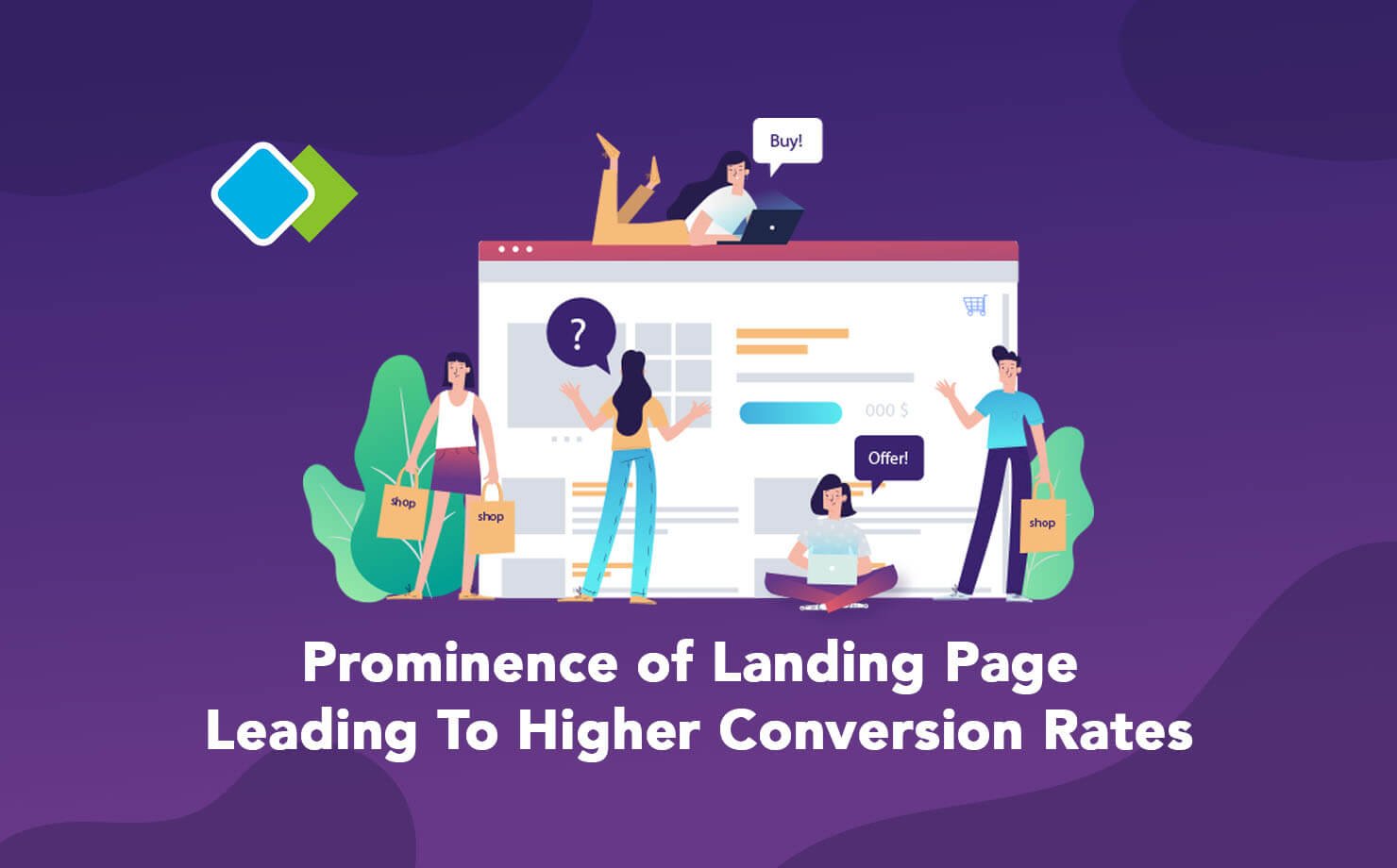
As we dive into the importance of designing an effective landing page, having a quick idea about the same is needed. A landing page is not a new term for all the tech enthusiast and you might also have heard this term before. The pages where a user is directed on clicking a particular service or product voices landing page.
No matter if it’s a part of your PPC campaign or an email flutter, an attractive and viable landing page largely dominates the conversion rates. But wait, do you have an idea as to what does conversion rate means?
In lay man’s term, it is merely the customer traffic directed to your website and likewise turning visitors to potential customers. Several studies reveal that a landing page is far more proficient than a web page to drive higher conversion. However, while you are to design a landing page, you should be clear on the goals your page should focus and likewise induce a call to action option.
Call to action is basically the next step, a user must take after he is ready to vent out in your services. It is largely important that the Call to action is goal specific and does not wander. A complete guide right from heading to the overall layout, call to action pages should ensure a seamless workflow.
Growth in popularity of mobile apps, we will tell you why?
Need Of Landing Page?
Amidst all of this, you might be wondering why a landing page when you already have a home page. Well, this is predominantly required.
Landing pages have a higher probability of lead generation. Driving multiple customers to land at your page is all that a landing page does. Seeing the current market trends, business enthusiast seek the need for a landing page owing to the following reasons:
- Lead Generation
- Leverage Branding
- Boost Conversion
- Increase your email list.
- Ease the process of A/B tests.
- Conducting user research
Needless to state that as of now every company strives to attain all of the above and hence professional consider having a landing page largely necessary.
Using Landing Pages To Drive Maximum Benefit
According to reports, nearly 48% of the total marketers design a landing page to boost their marketing campaigns. However, different business companies have varied landing pages and so you must understand specs of each and draft your page that helps generate greater leads a d finally leads to greater conversion rates.

- Coming Soon: Anticipating Services
Often, business professional considers marketing a product only after it's launch. But sometimes, it is better to induce a wait state among the potential users. Flaunt your product or service long before it lands in the market. Create an atmosphere where people await its launch. Keeping your target audience engaged is an excellent idea to create a large user base.
- Add a video
It is always advised to include a short video in your landing page. For products or services that cannot be defined by a simple list of sentences, it is expected that you add a video about the same. This not just voices your brand effectively bit additionally supports the creation of a shorter landing page. However, be careful about the duration and the video quality. Try embrace as much as information in a shorter possible video. And do not compromise with the video quality. Try adding phrases instead of lengthy paragraphs.
- Promote The Key Points
Use your landing page to reflect all that's important. Undoubtedly, a video is a great option but few prefer text over voice and so put up all the main features and highlight them in your page. Also, adding texts leverages SEO ranking of your website. If you have fewer features, explain each else filter the core content and state the same.
- Induce a landing page that helps generate leads
A landing page is not a simple web page providing relevant information but a responsive page that seek results from actions. Only when a visitor converts to a customer, is the presence of landing page justified. Quit cold calling and let your landing page speak on behalf of you and your brand.
- Focus on the issue before giving solutions
No doubt, your product/ Service is exceptionally good but it always suggested to expose the problem for which your business provides solutions. Knowing the right place is always a better option. Address the concerns of the target audience and then step forward to be the guide. Highlight the problem followed by a call to action reimbursing the issue and opening up to the available solution.
We Resonating Customer Needs
Effective Ways To Make The Most Of Landing Pages
True that every business must induce an effective landing page for enhanced lead generation, but the page must be as good as one that can actually help attain the above-mentioned benefits. Just drafting a simple page would not help leverage conversion rates. You should be tread cautious while you design a landing page for your website.
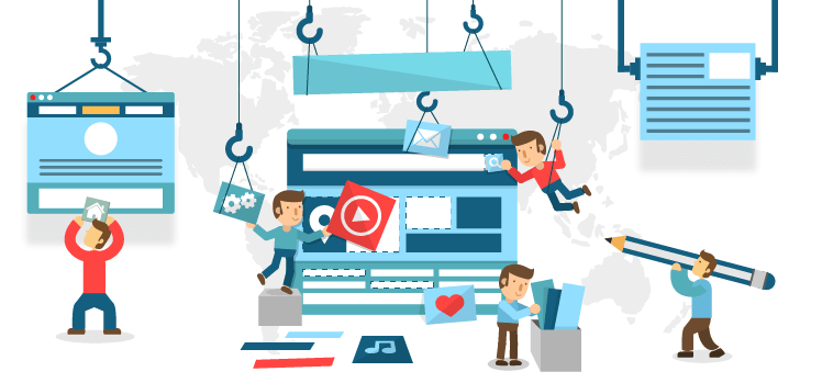
Look out for the following to ensure your websites landing page does not become a simple web page.
- Keep It Simple
The sole purpose of creating a landing page is to ease the entire process of serving consumers. Your landing page must not misguide users. Keep it as simple and directive as possible. Do not beat around the bush but stick to your goals. Unnecessary information and the inability to get to the desired point would result in reduced traffic and people leaving pages too early.
- Concise & Precise
Ah, creativity is always suggested but not in case of landing pages. Adding too much or too less would just compel customers to leave. It's a page for customers to know exactly what needs to be done and how. So, keep aside creativity for other pages or rather blogs and keep your landing page more of goal-oriented.
It is obvious that only if a person is genuinely interested in your business, will he jump from your home page to the landing page. Be it the result of your email campaigns or the PPC stuff, but they are there, so let your landing page voice your brand and be a lot more persuasive. Customers visiting landing pages have expectations and it is desirable that your page effectively fulfills the same.
Your landing page must direct users and a call to action supporting each direction. Draft your page in a such that eventually leads them to the end. No scope to cut out I'm between. Connect each page so beautifully that not just the customer's purpose is served but also drive benefits to your business.
- Seek Relevant Information
Do not flood your landing page with unwanted data and in case your page necessitates the need of a form, them be pretty sure that it seeks minimal information. Only the crucial ones to be asked. For instance, a newsletter only requires an email, so do not add any unwanted information.
No matter what the form aims to attain, ask only those information that directly serves the purpose. An effective Landing page increases users interest. Probing much might lead to reduced traffic and likewise decreased conversion rates.
- An attractive Design
Undeniably, the first experience is the last. Design your page that attracts user attention at the first go. Leave the rest on the page content. But the first prominently required a captivating design. If it pleases their eyes, they will definitely stop by. On the other hand, poor design increases the probability of reduced visibility. Keep it simple but something that captures customers interest.
- Say No To Navigation Elements
Landing Pages, unlike home pages, do not need navigational elements. All that it seeks is a call to action. Every line should direct users to the desired place. Only links present must lead to a specified destination. It should create a chain of information which is alternatively linked.
- Keep It Similar
Do not segregate the design of the landing page from the home page. It should be the same as the basic theme. No matter what all you include, landing pages should always echo your brand and own similar graphics. After all, landing pages are a subset of your business.
00
Thinking Using Media?
As stated earlier, including videos are a great way to enhance user engagement. According to a survey, it is seen that videos account to 64% of the total conversion rates. Also, web pages or the landing page having videos or photos reported a higher conversion rate. So, if you are planning to add mediator your landing page, you are on the right track. But wait, adding video or photo does not give you the license to add anything or everything.
You should be careful about anything you add as that has the direct impact on your sales.
- Try keeping videos as short as possible.
- Since the video speaks on behalf of your brand, it should be totally professional.
- Disable the autoplay option.
- A proper script for your video.
- Voiceover addresses your company.
Landing Page A/B Testing
Testing viability of a website after it’s creation is termed as the A/B testing. Once you have created a landing page, build 2-3 variants of the same and test all of them to see which variant experiences the maximum traffic. The one that has greater visibility is chosen to be added to the website. Experimenting multiple pages to finally rule out the best one is what A/B testing aims to achieve.
Optimizing Conversion Rates Using Landing Pages
Though landing pages do not induce creativity or multiple navigational too and are primarily simple, if designed and used in it’s the best way could be deemed as high converting landing page. Consider, you have built an excellent page, exceptional graphics, design, specs all perfect. And of course, it experiences traffic too. But witnesses a conversion rate of less than 2.35%.
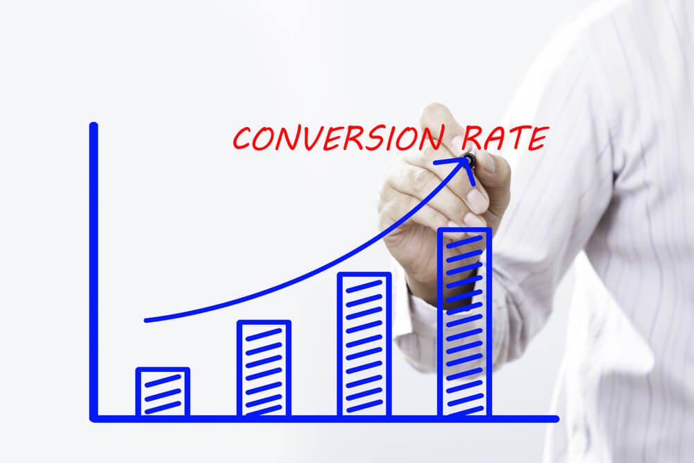
Worried? You should be.
You did all. Pocketed AdWords with a pool of money, drafted an exquisite model but still fail to generate leads.
Don’t worry, we have something for you. Here, we list down the things you should employ while designing a landing page and witness greater rates of conversion.
- 0Extensive Language Voicing Your Work
Use words that hit and capture focus. Language that echoes the needs of customers. Explain their problem to connect. Don't sympathize but empathize.
- Build User Trust
Include features that users expect but never anticipate. Be it a return policy or live support. Stay connected. Provide feedbacks of your previous clients. Express To Impress.
- Reduce the Word Length
Express in shortest possible sentences. Speak for your brand but effectively. Keyword Optimization is the key. But you should be careful while using them. Shooting out huge lines at the page entry would direct exit. Simple sentences but effective ones to enhance conversion rates.
Landing Page - Types
While we were busy seeing what a landing page is and how does it help generate leads, we skipped the types. There are plenty and each has its own specs. As you head out to build one page, you should first identify it’s a type and then design accordingly.
Naming them:
- Click Through: A simple page to provide significant insights about a particular offer.
- Lead Capture: The primary aim of such a landing page is to gather customer information. The only way to exit is to submit and then leave.
- Informecial: As the name suggests, the page I’d decked up with information. It’s like a black hole. As you read further, you go deeper. There is no way to back out.
- Viral Landing: The page is simply created to socialize brand.
- Microsites: It’s a shorter version of websites. Has a pool of information and though induces multiple pages, it is still deemed as a landing page driving user base from an ad campaign.
- Product Detail: You can also consider this as the main page. It has all relevant information on the product and target users to indulge in sales.
- Homepage: Sometimes developers are too lazy to design a new page and so stick to a home page for adding product information. Undeniably, it is worst in terms of lead generation and so you should avoid employing this.
To end this, landing pages are a great concept and help business enthusiast convert sales and generate leads. If your website does not have one, set out to add one.


